hmm my comments mirror some of the others sorry. I too would move the title closer to the photo and I would move it a smidge to the left. I like the flowers, but I agree there needs to be more, the space between flowers is distracting. I like to add glittery circle paper punches pop dotted to the centers of my flowers. I think you have one amazing layout going there!
SHCG: Ok, I love this! I love it, love it, love it! I love the retro fifties feel that I get with the checkerboard floor and the pink and black gives off a total diner feel. You may not have been going for that, but by goodness, that is where it took me. I had a rottweiler/labrador mix that died recently and seeing your fabulous pic of your buddy and your best friend is bittersweet. However, I persevere.... Ok, suggestions. First, leave that big ole pink daisy in the bottom corner and then take the other two flowers and layer them on top of it. I'm thinking that the center of those flowers would be about 1/3 into the big flower on either side. The black scrolls would then mimic stems/vines from the smaller flowers. Feel me? Bring that fabulous handcut title down and put it just above the photo, starting just to the right of the ric-rac. Then, (don't listen to Brenda) take yourself a black pen, outline your photo, then outline the pink mat. THEN, outline the letters in that title to make it pop. Now for funsies, I would outline random parts of the ric-rac to create visual interest. Three dots here, swirly there. Ok, that's it. I'm telling you that I love this layout. Has anyone told you that your handwriting is simply divine? It is. Superb, fantabulous job, here girlfriend!
SHCG: I did not go back and read the other comments, so mine may be duplicated... I love the pink on this page along with the white space. I love that big, pink daisy and think I would leave that buy scatter around some smaller pink flowers in some of the white space. Right now my eye automatically goes to that big pink flower and I think some smller, scattered flowers would balance out the large flower. If you feel comfortable with your hands, as I am sure you do since you cut out the title, I was going to say you could draw a scribbly border around the title...just to make it pop a little bit.
SHCG: this pic is adorable, and I love the simple design! I agree that changing the big pink flower for some smaller ones would be a good idea, and would add a thin black mat behind the pink one to make the pic pop out more.
SHCG: Awww he's so handsome! (from a fellow Rottie owner). I think you have some great suggestions below. I am usually more attracted to the simpler looks of a lo so i really like this. I do agree however that the biggest pink flower may be better off replaced by a few smaller ones. I love the swirlies and girl if you hand cut that title, you rock!
SHCG: I think the pink daisy distracts from the photo. Bunching the flowers closer would be great and adding another mat to the photo may help. Make sure the white space around the edge of the layout is more or less the same. The flower hits the edge, but then you have all this other white space at the other ends of the LO that make it seem "off". I would also pull the title in a bit closer to the photo, because it seems to float without an anchor. TFS!
SHCG: love the colors and simplicity of this page. also love that picture. I think I'd add a black mat. I'd also move those two flowers a little closer to the big flower, or replace them with smaller flowers to not distract from the picture. really great page so far, love the simplicity and the flourishes with all of the white space.
SHCG - What an adorable pic, so excellent they're so sweet w/ each other! I think this a great page so far but I understand your doubts. You've gotten fab ideas below...I like the addition of a black matte around the photo, or black inking (of the photo & the pink matte) would look great, it would emphasize the pic more as well as repeat the black from the awesome swirls & the handwriting. You have nice handwriting, BTW! I also like the idea of moving the title in a bit more but I think for me it's more about emphasizing the photo more than it is now so if it was matted or inked, maybe moving in the title wouldn't be as desirable to me. Amazing job handcutting the title, looks MAHvelous! I dig the black/pink/white color scheme, goes great w/ your pic & is oh-so-pretty. Lovely job so far!
nice job on the hand-cut title! i think the LO is fine the way it is... one thing i would change though is using darker cardstock for matting instead of pink.. black maybe?
SHCG: Very cute page. i see what you are saying about something isnt right. the only thing that i can think of is if you centered everything a bit more till the middle....then it would even out the white space and keep the layout simple w/o having to add anything else to it. if you wanted it to pop, i would double mat the photo and add some foam adhesive to it.
Yay, a fellow-handcutter! I do a lot of my titles that way. It's a great lo, but I do agree the title might work better closer to the other stuff. There just seems to be a lot of space, setting it too far apart.
SHCG: First off, props to you for hand cutting that title. I love the flourishes accented by your handwriting. I think what your page needs is more dimension. I'd start by moving the title straight down almost up against the corner flourish. Doing this will keep the eyes directed toward the photo. If you're up for more handcutting, the title could also use a darker shadow. I was going to suggest a double mat, but I have another idea. Outline the photo in black pen (or maybe even dots to mimic the ones in the flowers and flourishes) and place two torn coordinating pp rectangles, each about a cm thick (kinda hard to gauge measurement here), so that they stick out horizontally from the top of the photo, and vertically from the photo's right side. Wendy's got this layering thing down pat, so she'd be a better person for these kinds of suggestions. Wah! Now, we've got a coupla of ink junkies in our CG who might also suggest inking the light pink mat to give it more lift. They might also persuade you to powder the edges of your white textured cs (love that you used this, btw) while you're at it. I'm not saying I roll with that crew who runs the stuff up their veins or anything. I'm more of a recreational ink user. If you wanna hang with them, far be it from me to stop you. [Shrug] I'm just sayin'... Anyway, I love your color combo. Finally, the big pink flower could probably stand to have a bigger center. That's all. I have said my peace. It's your life. Make the right decisions for you. [Arms folded.]
If I'd hand cut it, it wouldn't be legible as a word. It looks fine. I kinda like the negative space the distance creates between title and photo -- gives the eyes more places to wander to after taking in the picture.
You hand cut that title?! Whoa! I could never hand cut and have it come out that good! I agree with moving the title down a bit, or, make it bigger so it fills up more space. You could also add a second mat behind the picture to bring it off the page more, but I think this looks awesome - and love those flowers!!
This is FAB!!! LOVE the flowers and flourishes! I keep wanting to move the title in towards the pic. Don't know what exactly that would accomplish but going with my gut here. Awesome job hand-cutting the title!!!
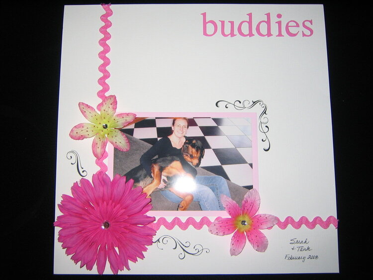
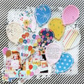
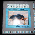
Sorry for the glare! This is Tank & my best friend... they love each other! I thought this photo was too cute not to scrap. I know there is something not quite right about it, but after spending 3+ hours on it, I just decided it would stay the way it is! Again, I handcut the title, so if it doesn't look just right, that's why.
Does this project or one of it's images contain pornography, profanity, or other illegal or offensive material? If so, please report it and our moderators will come by and clean it up in a flash.
October 28, 2008
May 09, 2008
April 15, 2008
March 31, 2008
March 31, 2008
March 29, 2008
March 28, 2008
March 24, 2008
March 19, 2008
March 18, 2008
March 18, 2008
March 18, 2008
March 18, 2008
March 18, 2008
March 17, 2008
March 17, 2008
March 17, 2008
March 17, 2008
March 17, 2008
March 17, 2008
March 17, 2008