SHCG: Marlene, he is such an uber-cutie that I can't take it! He is adorable in his shades and I love the whole concept of the layout. You totally rocked the monochromatic challenge. The green rocks. My only suggestion (and only because this is something that I am OCD about) is maybe to ink or outline the squares to make them stand apart from one another. Otherwise, I wouldn't change a thing. Super layout!
SHCg: First, your little guy is not only adorable in those shades but also the coolest!!! Second, I love green & the way you created the pattern with the little squares. Third, Love monkeys so that photo is just the topper on the cake (along with the buttons). Great job!
SHCG: He definitely is cool!!! Love how you added the squares in the middle of the page and have him leaning into them. It really catches your eye and draws you into the page!! AWESOME!!
SHCG: I absolutely love how you cut out the photo of Max... cool effect! I also love your quilt effect with the green squares. After reading Brenda's comment, I think she's onto something with adding "YOU" to the title... with your squares, I can see one large letter on each of the three squares on top directly to the left of "gotta" and then I'd add a big green chipboard arrow pointing to Max. Might get a little busy, but it could be cute. :) Great LO!
SHCG: I'm green with envy over this page! Max is uber cool here! The sock monkey is too cute! I love all the squares, too! The buttons and lace are a nice textural addition. I'll even forgive that the buttons are not threaded. OMG! Two things: I'd like to see a big YOU added in all caps and a different font to the title. Also, I'm not sure about extending the buttons and lace to the edge of the page, just to mirror and balance out the white space you have going in the upper left of the page. A fabulous BWC idea I can't wait to try, Marlene!
shcg: wonderful work! i like the whole lo. the only thing i notice is i would have left more of a border on the right side to match the green border on the left. however he is just too cute, and deffinatly cool in those shades!
SHCG - What a groovy page & wonderful response to your own way-cool challenge! Max looks too cool w/ his shades on, I adore that pic & all the marvelous greenliness goin on - the green squares, buttons & trim, the doodling around the journaling, the sock money, all of it! I could visualize adding a little something to put a bit more emphasis around Max because there's so much going on here, but I'm not sure what - this is already a splendid page as is. Nice work, Marlene!
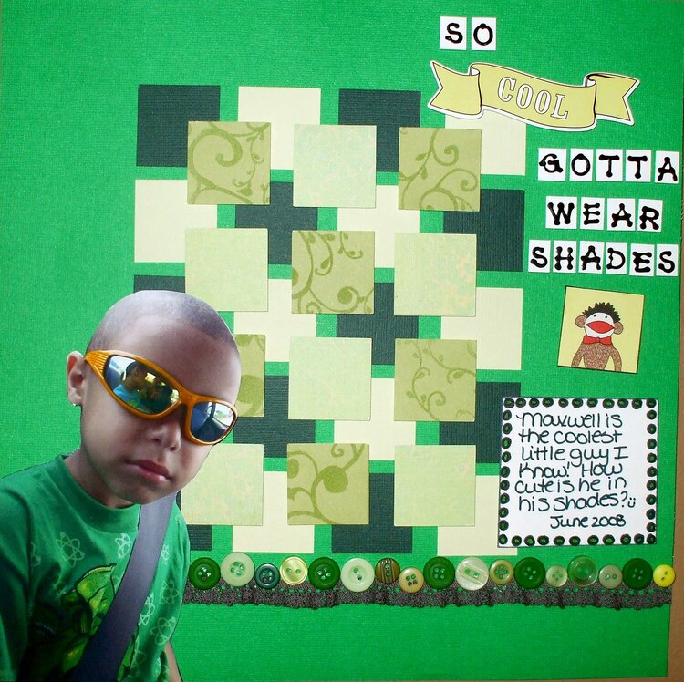
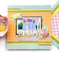
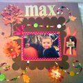
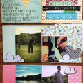
For this challenge, I'm challenging everyone to do a monochromatic layout. This is my response, I love how it turned out. I love green and I found this pic of Max wearing green and it worked out great! I love the little sock monkey LOL TFL :)
Does this project or one of it's images contain pornography, profanity, or other illegal or offensive material? If so, please report it and our moderators will come by and clean it up in a flash.
March 01, 2009
February 18, 2009
November 27, 2008
November 11, 2008
November 03, 2008
October 23, 2008
October 20, 2008
October 19, 2008
October 19, 2008
October 18, 2008
October 18, 2008
October 17, 2008
October 16, 2008
October 16, 2008
October 13, 2008
October 13, 2008
October 13, 2008
October 12, 2008
October 12, 2008
October 12, 2008
October 11, 2008
October 11, 2008