FREE Standard Shipping on Orders $69+ with code:
FREESHIPPING

Cheers
Give a Cheer

 Give a Cheer
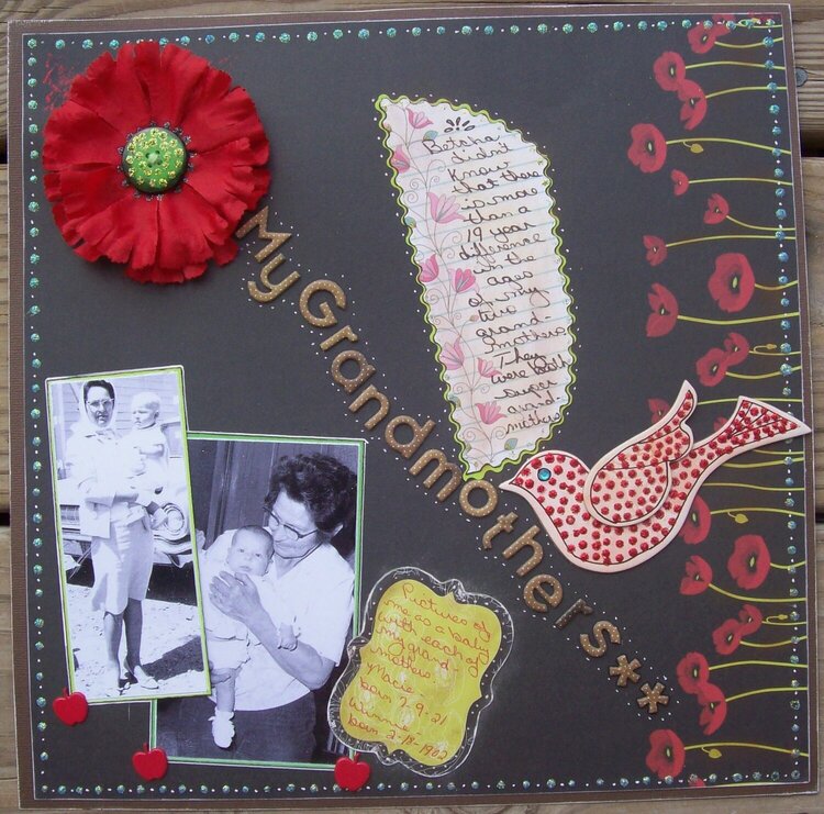
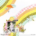
This is my lo for the FEBULY Challenge
WEEK 5 CHALLENGE:
This weeks challenge is DESIGNER INSPIRED. You'll need to:
-Find a designer brand that will influence your next scrapbook LO. Whether it's Tommy Hilfiger's flag to your 4th of July pics., a Coach Signature handbag to your coach class seating at that last trip you made or D&G (Dolce & Gabbana) which could be the same initials as 2 people you know. It DOES NOT have to be a High End brand. It can be Levi's, Gymboree, even a Walmart brand. The possibilities on this are endless with all the clothing line apparel out there these days.
MINE: I chose Apple Bottom, because I saw a shirt in a store a few weeks ago and loved it (not enough to pay the price LOL) and thought it would be a great influence for a sb page (I AM a scrapper :D ) and the colors and textures reminded me of hominess and my grandmothers.
-You need to add some kind of bling to your LO's.
MINE: I used a gem for the eye on my Basic Grey chipboard bird and I dotted Stickles over the bird (the shirt I saw had a bird with blingy dots and two of the colors were tiffany blue and red..loved the color combo), I also used stickles on and around the button in the center of the flower and used dotted Stickles around the edge of the page.
-Your journaling must start with "Betcha didn't know...."
MINE: "Betcha didn't know that there is more than a 19 year difference in the ages of my two grandmothers. They were both super grandmothers."
-and last but not least you need to incorporate the same colors as the brand of your choosing. So, if you chose Tommy Hilfiger you would need to incorporate the colors red, white and blue on your LO. If you chose Gymboree, you would choose a certain line and then use the color scheme off that and so forth.
MINE: I looked on their website and it seemed to me that ther colors were black with a touch of golden brown and red, so I used the black pp as the background and matted it onto brown cs. The red poppies on the paper added some read. I used Basic Grey brown chipboard aphas for the title and added a red poppy (made by taking apart a carnation and just using two of the layers, I used a button for the center, added green stickles to the button and black stickles around the button). I added three apple brads to the bottom of the pics to give the touch of "Apple Bottom" and because I was the apple of my grandmothers' eyes. :D
I used pics of me (as a baby) with each of my grandmothers, to help show the difference in their ages. I cropped the pics down to just highlight the two of us and I adhered them to page and drew around them with a white pen. I used a journaling block that coordinated with the background paper, because it seemed that I just needed a third item to make the pics not look awkward on the page. LOL I edged it with the white pen, too. also used the white pen to dot in between the Stickle dots around the edge of the page nd to dot along the edges of the title. I cut the main journaling block into a 'sorta' leaf shape, to go along with the title representing the stem of the flower.
No products have been added to this project.


Thanks for spreading positivity!


April 08, 2009
March 27, 2009
March 25, 2009
March 24, 2009
March 24, 2009
March 23, 2009
March 23, 2009
March 23, 2009
March 23, 2009
March 23, 2009
March 23, 2009
March 23, 2009
March 23, 2009
March 22, 2009
March 22, 2009
March 22, 2009
March 22, 2009
March 22, 2009
March 22, 2009
March 22, 2009
March 22, 2009
March 22, 2009
March 22, 2009
March 22, 2009