Happy National Scrapbook Day!
Extra 10% OFF Select Scrapbooking Brands with Code: NSD24
Extra 10% OFF Select Scrapbooking Brands with Code: NSD24

 Give a Cheer
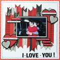
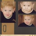
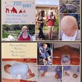
This is a partial scraplift from a very talented Blue Crew member of another site (designsbybrianna is her usrname).
No products have been added to this project.
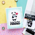
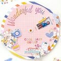
Thanks for spreading positivity!


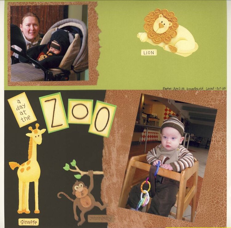
April 29, 2006
February 14, 2006
January 12, 2006
January 11, 2006