

Stamps, Inks, & Stamping Accessories on SALE!
Take 9% OFF orders $100 or more with code: SPRING
Take 9% OFF orders $100 or more with code: SPRING

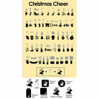
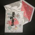
 Give a Cheer
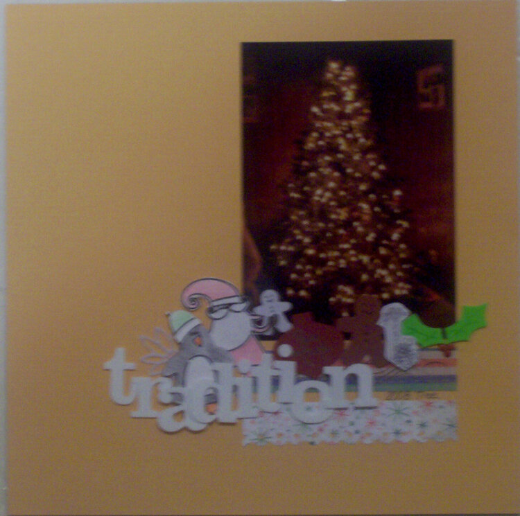
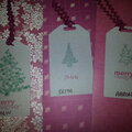
It's always a tradition in my home to do up a tree for Christmas.
2008 tree


Thanks for spreading positivity!


June 22, 2009
June 10, 2009
June 07, 2009
June 06, 2009
June 04, 2009
June 03, 2009
June 02, 2009
June 01, 2009
May 30, 2009