
Happy National Scrapbook Day!
FREE Gifts + Extra 12% OFF Orders With Code: CELEBRATE
FREE Gifts + Extra 12% OFF Orders With Code: CELEBRATE

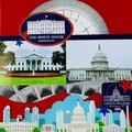
 Give a Cheer
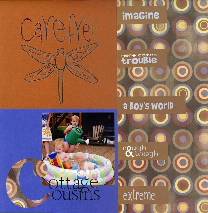
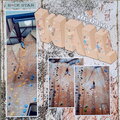
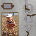
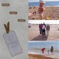
CS: Bassill
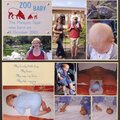
Rubons: Autumn Leaves
PP: cannot remember...but I love it
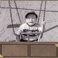
Boy Words:reel words by We3
Monogram Shape: Basic Grey
No products have been added to this project.
Thanks for spreading positivity!


April 30, 2006
February 18, 2006
February 18, 2006
February 18, 2006
February 17, 2006
February 17, 2006
February 17, 2006
February 16, 2006