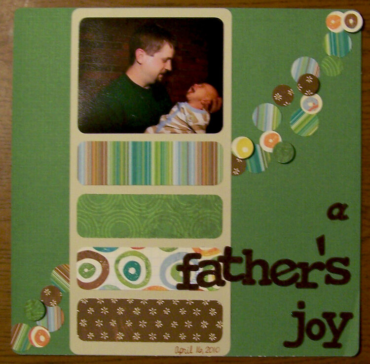
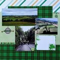
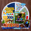
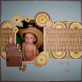
SHCG: I like seeing the trail of circles again that made an appearance in your winged pregnancy mini album, and the dimension you incorporated here which adds more interest and movement to the whole page. All your colors and pps are nicely coordinated and do a good job of complementing that sweet photo. I love how you placed it off center at the top of the page. The a in the title is the only thing that seems outta place and I'd definitely like to see it above father, in the green pp, perhaps above left of the f or right over it. I like that you included the date, but I'd like to see one more piece of info below the photo on the upper right of the striped pp, that adds a little more about this moment. I love the simplicity of this and have to add it to my long list of Chris scrapjacks.
SHCG: Great choice of colors! I really like the blockng you did and the round edges as well. I agree with the suggestions for moving the a to the fronnt of the word father. I also thnk it would look great if you added some browngreen embelly to the top left of the page so that the eye moves more in that directon
SHCG - Priceless pic & great LO! The green & brown works so well on this masculine LO. Love the pp circles & rounded rectangles. I like Wendy's suggestion of moving the "a"; I can also see it above "father's" (btw the "t" & "h" so it doesn't get lost in the pp).
SHCG: I love this layout, I don't remember where I commented on it before LOL I'm loosing it. Anyways, I love the colors, the design and the circles, fab!!! :)
SHCG: What a great page! I love the green with the browns! The design is very nice! The circles going diagonal are perfect! Love the title and where you placed it!
SHCG: I love the perplexed look on your husband's face! I also really like your design of cicles on this page. My suggestion would be to take the "a" and move it to right in front of the word "father's" rather than on top of it. The way your circles are placed, draws my eye to the upper corner and then the letter "a" is sort of an abrupt stop. --Not sure if I explained that quite right, but you could try moving it and see if you like it. This is a beautiful page and I love the greens and browns together.
Does this project or one of it's images contain pornography, profanity, or other illegal or offensive material? If so, please report it and our moderators will come by and clean it up in a flash.


 Give a Cheer


August 29, 2010
August 27, 2010
August 25, 2010
August 23, 2010
August 23, 2010
August 23, 2010
August 23, 2010
August 17, 2010
August 15, 2010
August 13, 2010
August 12, 2010
August 11, 2010
August 11, 2010
August 10, 2010
August 10, 2010
August 10, 2010
August 09, 2010
August 09, 2010
August 09, 2010
August 09, 2010
August 08, 2010
August 08, 2010
August 07, 2010
August 07, 2010
August 07, 2010
August 07, 2010
August 07, 2010
August 07, 2010
August 07, 2010
August 06, 2010
August 06, 2010
August 06, 2010
August 06, 2010
August 06, 2010