FREE Standard Shipping on Orders $69+ with code:
FREESHIPPING

Cheers
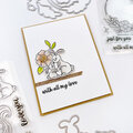
Give a Cheer

 Give a Cheer
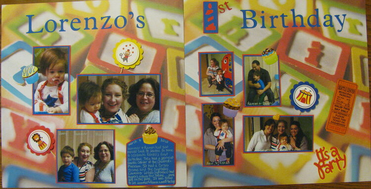
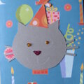
a friend of mine had moved back into Seatlle from California and this was the first chance I had to see her. I didn't get to see the older son when he was a baby so I was glad to have the opportunity to see all of them. It was a clown theme and this paper was the closest I could come up with and the colors worked.
No products have been added to this project.


Thanks for spreading positivity!


January 30, 2011
January 17, 2011
January 12, 2011
January 03, 2011
January 01, 2011
December 30, 2010
December 27, 2010
December 26, 2010