LOVE this on too. Not too bright - reminds me of a new day dawning - so full of life!! And what better way to represent Christmas?? Love the punchwork - that little fence was the perfect choice.
Just gorgeous Jilly. I love the use of non-traditional holiday colours, it is definitely more reflective of the colours we see in Australia at Christmas time, love the stamping work and no, I don't think it's too bright at all. Please don't give up, LOL. I love it. Fave.
I agree with the previous comments. While this one is nice, the other one is definitely my favorite! I think, you'd WANT it to be "countrified" as you said. The very photo lends itself to that feel with the horse, cowboy hats, etc. And I like the scrunched paper that you used as well. Yep, my vote is definitely for #1.
Never give up! Have fun! Love the background, painting and stamping. I like the red Christmas word and little drops of red throughout. This one is very cool and creative! The other one is PERFECT!
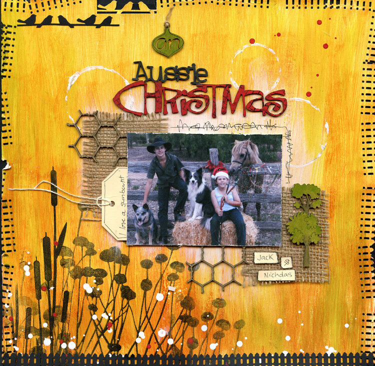
Same photo, very different colours. Too bright, maybe I should try again (or just give up)! Used the new Scrap FX bullrush and field of flower stamps here.
Does this project or one of it's images contain pornography, profanity, or other illegal or offensive material? If so, please report it and our moderators will come by and clean it up in a flash.
September 15, 2013
September 15, 2013
September 15, 2013
September 09, 2013
September 02, 2013
September 02, 2013
September 02, 2013
September 02, 2013
September 01, 2013
September 01, 2013
August 29, 2013
August 29, 2013
August 29, 2013
August 28, 2013
August 28, 2013
August 28, 2013
August 28, 2013
August 28, 2013
August 28, 2013
August 28, 2013
August 28, 2013
August 28, 2013
August 28, 2013
August 28, 2013