Happy National Scrapbook Day!
Extra 10% OFF Select Scrapbooking Brands with Code: NSD24
Extra 10% OFF Select Scrapbooking Brands with Code: NSD24

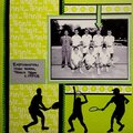
 Give a Cheer
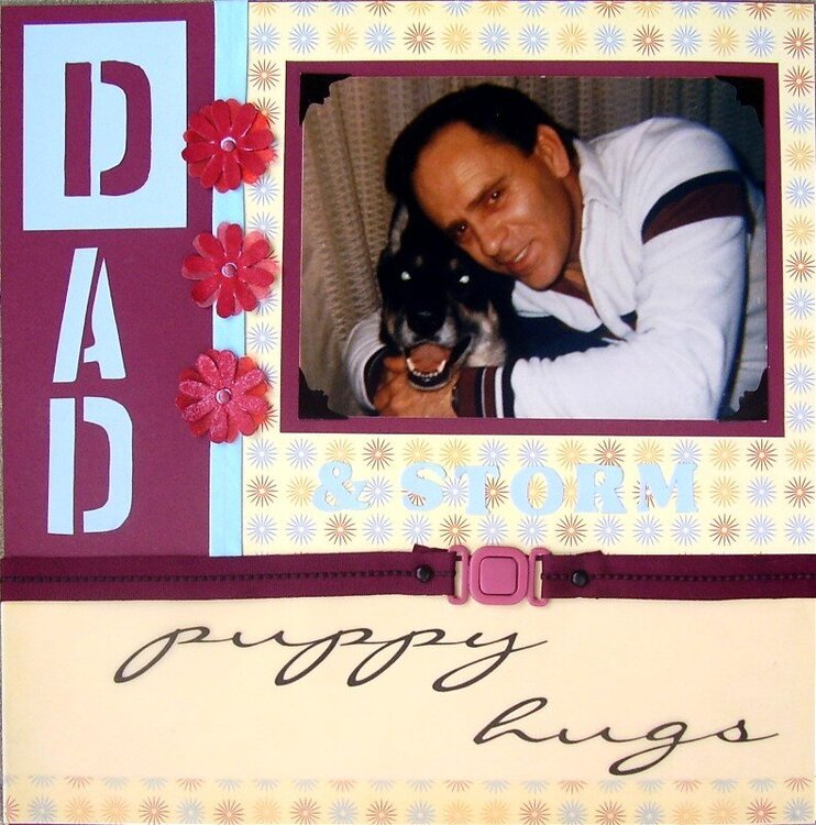
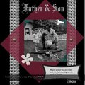
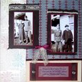
This is my father quite a few years ago, with his dog Storm...
No products have been added to this project.
Thanks for spreading positivity!


August 14, 2006
August 14, 2006
August 14, 2006
August 13, 2006
August 13, 2006
August 13, 2006
August 13, 2006
August 13, 2006
August 13, 2006
August 13, 2006
August 13, 2006
August 13, 2006
August 13, 2006
August 13, 2006
August 13, 2006
August 13, 2006