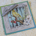
i really like the journaling. I like the lo actually. maybe using the lo for another photo and doing something different with the journaling and photo, a rustic americana maybe? I love the lo though.
I like it. It stands out. Maybe some heavy black inking around the cs & maybe a journaling block extending from under the photo that has bolder black letters?
I think it looks pretty nice, Amanda! I actually love the title - the way you did the torn paper strips and inking looks cool! Maybe to help enhance that, you re-cut the letters in black and the lighter pink and make the black ones a little bigger than the pink, then mat the pink letters on the black (was that confusing? i hope not!) I love the look of the handwritten journaling on white - I think it's a perfect compliment to the LO, maybe you could add some hand-drawn doodles to some of the white space (like flourishes/swirls) to help... Also - remember the rule of 3! If you put another set of three brads somewhere else I can almost promise that the LO will look totally different! Try arranging the groups of brads in a "triangle" that will inadvertently draw attention to your photo (maybe the bottom corner?) Also, following up to what Sabrena said, maybe use muted tones of red in addition to the pink (or in place of??) I don't know... good photo, and you were going in the right direction I think... I hope that was helpful to you!
I like the LO, just think that the colors aren't very....ah-hem....manly....
I think that it would be better in a different color scheme--the pink just throws me off....
I like it! The focus is on the incredible relationship of your two guys, rather than fancy embellishments and such. Congrats on finding a gem of a husband - not all guys have it in them to love a child so much that isn't biologically theirs. And how lucky is your son, to have such a great DAD!!!
I love the brads and the chain of hearts! They are both super cute. I agree that a different photo might be a good idea. The only other thing I can think of is maybe the "Daddy" title doesn't stand out enough. The black letters with the black ink makes it kinda blend together. Maybe white letters with black ink??
i love the layout but i dont really care for the picture. i know you have cuter pics of them. i think a new picture would change your opinon of the page.
Well.... I really like the strip of hearts, the distressed title, and the brads. Maybe you want to put another heart or something in the lower left hand corner, if you're not happy with it the way it is.
I love the way you did the title with the layers and inked edges and skinny letters. I also love the row of hearts on the black strip. Maybe all you need is a black mat showing a tiny bit under the pink mat of your photo? Really I think it is pretty the way it is!!
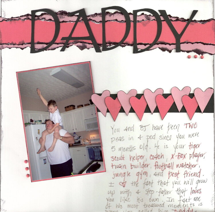
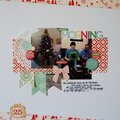
This is a lo of my husband and ds. I don't care for this lo at all. I may have to completely redo it...any suggestions are VERY WELCOME!
Journaling Reads: (sorry...the scan cut off the bottom) You and BJ have been TWO peas in a pod since you were 5 months old. He is your tiger scout helper, coach, X-Box player, train builder, football watcher, jungle gym, and best friend. I love the fact that you will grow up with a step-father that loves you like his own. In fact one of his most treasured moments is when you called him Daddy.
Does this project or one of it's images contain pornography, profanity, or other illegal or offensive material? If so, please report it and our moderators will come by and clean it up in a flash.
February 21, 2007
February 16, 2007
February 16, 2007
February 13, 2007
February 13, 2007
February 13, 2007
February 13, 2007
February 12, 2007
February 11, 2007
February 11, 2007
February 07, 2007
February 06, 2007
February 05, 2007
February 05, 2007
February 05, 2007
February 05, 2007
February 05, 2007
February 05, 2007
February 05, 2007
February 05, 2007
February 05, 2007
February 05, 2007
February 04, 2007
February 04, 2007
February 04, 2007
February 04, 2007
February 04, 2007
February 04, 2007
February 04, 2007