Mar '09
Mercytiara
I'm relatively new here and have found these forums really helpful, so thanks everyone for contributing your expertise!
Now on to my questions:
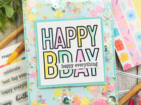
A few years ago before I was completely into scrapbooking I purchased a set of clear stamps and the acrylic block to go with them. I bought them at Michaels, and I paid a lot for them, so I think they were a good brand (I'm not at home so I can't check the brand). They came in a little clear plastic envelope that you store them in. I just cracked them open to use them last week and I found that when I spelled my DD's name out, the letters were too far apart. Do you have to trim the letters to get them to fit closer together, or are they supposed to stay far apart?
My second question is about ink. I think I have Prism ink (I had no idea what I was doing when I bought them, I just knew I needed ink) and I find it comes out really light when I stamp the image. Maybe I just need to practice, but I couldn't seem to get it to look like anything other than a watermark. Maybe my ink colour is too light? I have a package of ink that has shades of pink and purple all in one package, and I tried all of them. Maybe the ink is too old... I did buy it a few years ago.
Which brings me to my third question... how do you get the ink onto the stamp when the stamp is bigger than the ink pad (each colour of ink pad is quite small). What I did was I pressed the stamp onto the pad, while holding the pad upside down, then moved it carefully around on the surface of the pad until the whole image was covered. The ink pad wasn't very wet though, so I had to press fairly hard. The more I write, the more I think maybe my ink pad is dried out. Thoughts anyone? Any recomendations for ink that makes a dark crisp image? I've read the article about inks on this site, but never having stamped before, it was hard to follow.
Now on to my questions:
A few years ago before I was completely into scrapbooking I purchased a set of clear stamps and the acrylic block to go with them. I bought them at Michaels, and I paid a lot for them, so I think they were a good brand (I'm not at home so I can't check the brand). They came in a little clear plastic envelope that you store them in. I just cracked them open to use them last week and I found that when I spelled my DD's name out, the letters were too far apart. Do you have to trim the letters to get them to fit closer together, or are they supposed to stay far apart?
My second question is about ink. I think I have Prism ink (I had no idea what I was doing when I bought them, I just knew I needed ink) and I find it comes out really light when I stamp the image. Maybe I just need to practice, but I couldn't seem to get it to look like anything other than a watermark. Maybe my ink colour is too light? I have a package of ink that has shades of pink and purple all in one package, and I tried all of them. Maybe the ink is too old... I did buy it a few years ago.
Which brings me to my third question... how do you get the ink onto the stamp when the stamp is bigger than the ink pad (each colour of ink pad is quite small). What I did was I pressed the stamp onto the pad, while holding the pad upside down, then moved it carefully around on the surface of the pad until the whole image was covered. The ink pad wasn't very wet though, so I had to press fairly hard. The more I write, the more I think maybe my ink pad is dried out. Thoughts anyone? Any recomendations for ink that makes a dark crisp image? I've read the article about inks on this site, but never having stamped before, it was hard to follow.