


Be the first to cheer this project!

 Give a Cheer
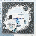
What says “spring” more than kite flying?!? We spent a cool, windy spring day flying our kites in the park. Even though the colors in the products I used are much softer and more “pastel” in tone, I felt like they worked okay with the photos - the overall design of my two-page layout includes a balanced amount of soft, patterned paper and brighter photos with an emphasis on the shades of yellow/orange in both. (Not to mention…with a house full of boys, I have to take advantage of any opportunity to scrap with pastels, butterflies, and flowers…and I wasn't going to let this one pass me by!!)
No products have been added to this project.


Thanks for spreading positivity!


