

$30.00 $19.99

$48.00 $44.99
$48.00 $44.99
$24.00 $17.99


")


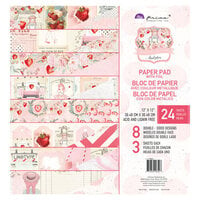
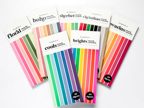
After I got the 12x12 pack, I had to get this pad too. This is perfect by itself for card-making or as matting for the full-sized pages. Love the quality and colors - beautiful!
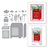
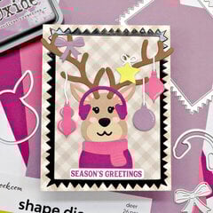
Used in this project: The Journey is the Destination

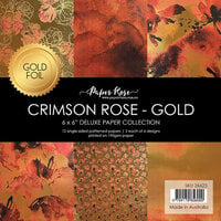
Lovely fall colors! I liked that they went together.
Haven't gotten to use it yet, but just looking through it I have lots of ideas for cards.
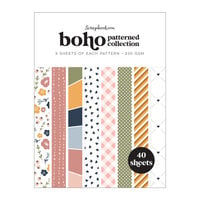
I like the color scheme of this theme, so I bought this pack without looking at all the papers—always a bad idea. There was too much repetition with the floral design, which I didn't even like that much to begin with (all of them would look more at home on one of those lamé blouses that a certain sort of Grandmother still wears, with gabardine slacks, while Going Downtown to buy every denomination of stamp so she'll always have exact postage), and same with the stripey pages. I like stripes as much as the next back-to-basics designer, but somehow Basic Grey and most other paper designers always screw them up by using too many colors or or colors that don't go together or that look muddy. Sometimes they try the trick of Sectioning: "Hey, we ran out of ideas, so we'll stripe it up over here, then flower it up over here, lather rinse repeat, and they'll never notice!" I always throw out those pages or make them into punchouts so no one will know of their shameful past.
What was best in this collection was the pages with the small repeating prints—tiny flowers repeated, tiny triangles, and so on. Most of the designs felt very closed and dark, but the coloring did feel rich. I always wish that Basic Grey's 6x6s were double-sided, maybe with a more open design on one side and a smaller repetitive pattern on the other.
This might be difficult for me to figure out how to use a lot of.
You must be signed in to comment. Please click here to sign in.