Take an Extra 10% OFF With Code: EXCLUSIVE
Store Inspiration Watch SBC Fest Creative Kindness More


Choosing Cardstock Colors?

  • A2jc4life
    Is there a trick to finding cardstock to coordinate with patterned papers? I have a Tattered & Worn paper pack by The Paper Studio. 350Wx350H-119602-0720-px.jpg

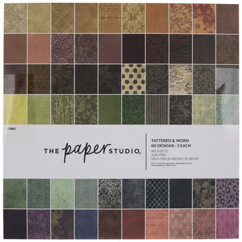
    I love it, but the colors are very deep/dark, and all of the solid cardstock I can find is too vivid to go with it. Unless I go only neutrals, everything clashes. Short of inking all the cardstock myself, either with ink to match or with black or dark grey to deepen and mute it, is there a better way to find paper than to search item by item through all the colored cardstock?
  • Christiescraps
    That is a tough one! I don't know of a better way. I've had the same problem with having trouble finding embellishments for a few paper pads I have like that, that didn't come from a collection. I've tried to look for coordinating stuff and it's a long process and I didn't end up with many results. Like you said, neutrals would work but I'm sure you want something different also. Let me know if you have any luck.
  • Sewflake
    I would start with looking at another paper pad by The Paper Studio. Often times the same manufacturer will use some of the same ink/tones colors used in other collections.
    I have been collecting card stock for years so have a vast library to search thru when putting papers together. I don't have the particular paper pad you have shown so I'm unable to give specific help.


  • Eapipkin
    I am making a journal right now using those papers. Stamperia papers goes good with it, Precious, Patchwork, Roses and Lace, Lilac Flowers, Grand Hotel, Lavender,to name a few. I can't recall all the names of the ones I'm using just now. When I go out to my Craft Palace this afternoon I will try to remember to look at what they are. I'm using tons of scraps too!
  • Dawna.s Place
    Not sure if you want plain colored cardstock, or another paper pack that pulls some color into the mix. If it's the later, Tim Holtz has a distressed looking paper in the same darker vintage tones, but with splashes of color. Here's a link to that: https://www.scrapbook.com/store/ch-th94022.html He also has paper back drops which go much lighter. Here's a link to that: https://www.scrapbook.com/store/ch-th94308.html

    If you want plain colored cardstock, you may want to opt for a contrasting color, rather than a matching color. This way you can pull in whatever colors you'd like to highlight on your layouts. Wishing you the best.
  • Lisn2cats
    If you use Dawna's suggestion of using a contrasting color, use a color wheel for reference (pick one of the colors and go to the other side of the wheel). The general rules of thumb when using the color wheel are:
    1) 3 to the left or right for shades that go well together
    2) opposite for complementary colors (e.g., red/green; blue/orange; yellow/purple)

    I use a couple of palette generators for work and quilting to help me since I am too lazy to figure out which color bin of papers I need to look through: Coolors.com and https://color.adobe.com/create/color-wheel (this might not be as useful if you're not familiar with hex colors BUT if you have the Color Grab app, it makes it a lot easier).

    Of course, I like my tried and true method - buy every single shade of colored paper as possible and build a nest with the scraps. My bedroom barely has a visible bed with all the paper bins! I need to find that paper pad - I'm loving the vintage-y distressed patterns!
  • CAQ
    I think contrasting and using these for layering. Are you thinking of those sheets for the main layer that will be most visible? If you want it visible, a contrasting layer behind. Blacks, dark browns and dark grays will add pop.

    Cut strips of these and glue them to fronts of contrasting sheets to create background, cut strips of contrasting and glue to those sheets for the same thing. Make one sheet wonder cards from them, you will be surprised.

    Thunk out of the box. Just don't look at them as whole sheets. Sounds easier than it is, but a different mindset might help.
  • A2jc4life
    Thank you all!

    I'm using them with a Kendra's Card Challenge set (so it's basically like one sheet wonders, just with more than one sheet). What I'm primarily looking for is basically matting layers, which probably need to be either solid or mostly solid. And I have a wide variety of plain cardstock here; it's just that nothing is especially dark. Even navy blue and forest green don't tend to go super-dark.
  • CAQ
    Why do you need dark? In looking at the phot, and I realize the colors may not be accurate, I see sheets that will work with beige, tan, lime green, white, yellows, cream, pinks, etc.