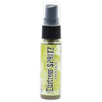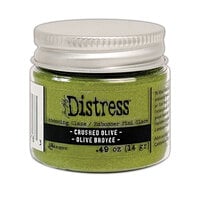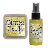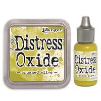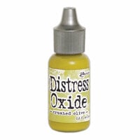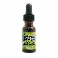



Bring rich, organic tones to your crafts with the Crushed Olive Distress Ink Pad by Tim Holtz for Ranger Ink. This bold olive-green ink is perfect for stamping, blending, and stenciling, adding vintage charm to cards, mixed media projects, and more. A must-have for nature-inspired designs!
$72.00 $68.49

Add vibrant, earthy tones to your projects with the Distress Ink Pad in Crushed Olive by Tim Holtz for Ranger Ink. This water-based dye ink delivers a bold olive-green hue, perfect for card making, mixed media, and nature-inspired designs. The acid-free, non-toxic formula blends beautifully on paper, fibers, and porous surfaces, creating vintage, aged effects with ease. The 2" x 2" raised pad allows for effortless inking of stamps, stenciling, and direct-to-paper techniques. Whether you're distressing edges, layering colors, or adding a pop of organic vibrancy, Crushed Olive brings warmth and depth to your handmade cards, journals, and scrapbook layouts.

This is my absolute favourite colour out of the 2010 range of distress inks. Suitable to use in Christmas crafts, it is quite vibrant and works with Rusty Hinge and Wild Honey beautifully! Watermarks well.


Great Ink pads!! great color (s)!!
I love that I can find the ink pads and the bottle refill for the same color(s) that I want---all on your email co.
These inks are perfect for backgrounds. The blend beautifully!
Ink blends easily, even through a stencil. Perfect on leaves with other greens
I did 90 stencils. Pad is still juicy.
Like Peeled Paint, Crushed Olive is warm but not yellow. Forest Moss is much darker and more old fashioned army green. I like Crushed Olive because is is a much more realistic spring green -- the brand new leaves found on some plants but not brilliant or stereotypical. Some people would call it a light olive but that is a grave disservice. Crushed Olive is a natural color, not drab or gray in any way.
If you want a pair of greens Crushed Olive and Peeled Paint are a good choice. But look at Bundled Sage and Old Paper first which are lighter and less saturated. It depends on the type of stamping or other that you want your greens to represent.

The color is deep and vibrate and certainly lives up to the Ranger standard I expect.
It goes great with Graphic 45's A Proper Gentleman
Whether stamping, blending or watercoloring, Tim Holtz inks work beautifully. Great colors too!
You must be signed in to comment. Please click here to sign in.