

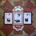
 Give a Cheer
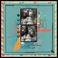
ds...completely chillin out on the couch on a Saturday morning...
Nikki Page All Things Good kit (on sale for $1 at FaithSisters!!)
No products have been added to this project.


Thanks for spreading positivity!


June 18, 2009
June 01, 2009
May 30, 2009
May 30, 2009
May 30, 2009
May 18, 2009
May 03, 2009
May 03, 2009
May 03, 2009
May 03, 2009
April 26, 2009