


Die Cutting on Sale All Week!
Take an Extra 11% OFF Orders $100 or More With Code: SMILE
Take an Extra 11% OFF Orders $100 or More With Code: SMILE


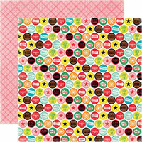
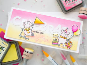
 Give a Cheer
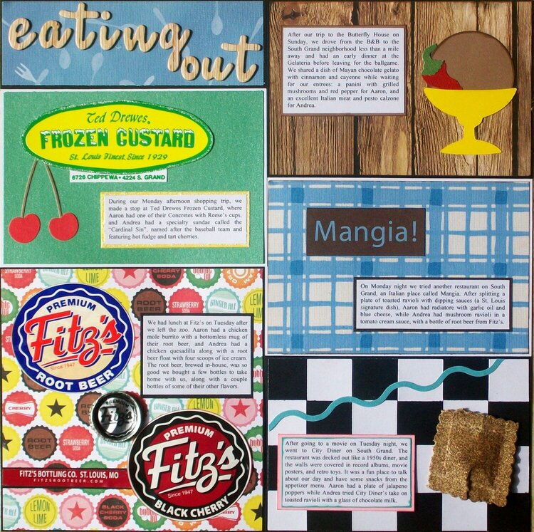
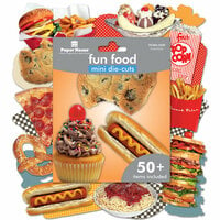
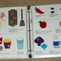
Eating Out
- Upper left - background paper from a food-themed stack by American Traditional Designs, title letters from the "Muse" alphabet Thickers by American Crafts.
- Upper right (Gelateria) - Background paper by Sugartree, ice cream dish cut from the non-pearlized side of Wausau cardstock using the "Fast Food" Cricut cartridge, gelato scoop cut from paper by American Traditional Designs using a Fiskars squeeze punch and edged with "Branch Bark" chalk ink by Prima, chili pepper adapted from the "Chili" die by Sizzix.
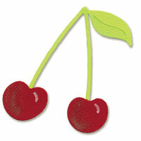
- Middle left (Ted Drewes) - Green and yellow pearlized paper by Wausau, store logo color-copied from the plastic dish, logo and journaling edged with Frosted Lace Stickles, cherries from the "Cherries" Sizzlits die by Sizzix using brown paper by American Traditional Designs and the non-pearlized side of Wausau cardstock.
- Middle right (Mangia) - Title and background paper from a food-themed stack by American Traditional Designs.
- Lower left (Fitz's) - Background paper from the "Happy Days" collection by Echo Park, labels and bottle cap from actual Fitz's products (bottle cap flattened using my Sizzix Big Kick).
- Lower left (City Diner) - Background paper made by weaving strips of cardstock; turquoise stripe from the "Strips" decorative strip by Sizzix; elements edged using "Teal Damask" and "Vintage Pink" chalk inks by Prima; toasted raviolis made using 150-grit sandpaper by 3M, one of my brown chalk inks by Prima, decorative edge scissors, and some foam squares.
102nd layout of 2013.


Thanks for spreading positivity!


April 01, 2021
September 25, 2017
September 25, 2017
December 23, 2015
November 20, 2014
September 18, 2014
September 18, 2014
June 29, 2014
April 27, 2014
April 27, 2014
April 27, 2014
March 14, 2014
September 09, 2013
August 29, 2013
August 04, 2013
August 02, 2013
July 31, 2013
July 31, 2013
July 30, 2013
July 30, 2013
July 30, 2013
July 30, 2013
July 30, 2013
July 30, 2013
July 30, 2013
July 30, 2013
July 30, 2013
July 30, 2013
July 30, 2013
July 30, 2013
July 30, 2013
July 30, 2013
July 30, 2013
July 30, 2013
July 30, 2013
July 30, 2013
July 30, 2013
July 30, 2013
July 30, 2013
July 30, 2013
July 30, 2013
July 30, 2013
July 30, 2013
July 30, 2013
July 30, 2013
July 30, 2013
July 30, 2013
July 30, 2013
July 30, 2013
July 30, 2013
July 30, 2013
July 30, 2013
July 30, 2013
July 30, 2013
July 30, 2013
July 30, 2013
July 30, 2013
July 30, 2013
July 29, 2013
July 29, 2013
July 29, 2013
July 29, 2013
July 29, 2013
July 29, 2013
July 29, 2013
July 29, 2013
July 29, 2013
July 29, 2013
July 29, 2013
July 29, 2013
July 29, 2013
July 29, 2013
July 29, 2013
July 29, 2013
July 29, 2013
July 29, 2013
July 29, 2013
July 29, 2013
July 29, 2013
July 29, 2013
July 29, 2013
July 28, 2013
July 28, 2013
July 28, 2013
July 28, 2013
July 28, 2013
July 28, 2013
July 28, 2013
July 28, 2013
July 28, 2013
July 28, 2013
July 28, 2013
July 28, 2013
July 28, 2013
July 28, 2013
July 28, 2013
July 28, 2013
July 28, 2013
July 28, 2013
July 28, 2013