Die Cutting on Sale All Week!
Take an Extra 11% OFF Orders $100 or More With Code: SMILE
Take an Extra 11% OFF Orders $100 or More With Code: SMILE


Be the first to cheer this project!

 Give a Cheer
"One of the greatest gifts as an artist and scrapbooker/card maker is 'color'. Usually, my color preference is 'the more, the merrier'. I'm always in the market for a dynamic, uplifting color palette, especially this time of year.
One of my favorite hues this season is Violet. It radiates freshness, an ideal quality fit for Spring! This is especially the case when paired with light olive green, emerald, gold, and a smidgen of pink and peach.
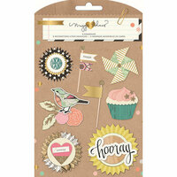
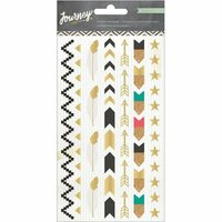
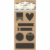
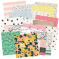
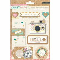
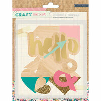
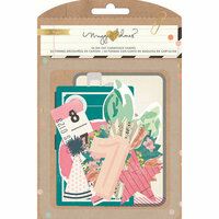
Today's project is a great example of the aforementioned color combination brought to light. The colors look fantastic together! I brought them full circle through a series of intricately created layers using the Crate Paper collections, Confetti & Craft Market (hints of Journey). The project itself is an investigation of color & everyday design. The end product is an inspiration board for my studio bookshelf."
http://crate.typepad.com/cratepaper/2015/03/one-of-the-greatest-gifts-as-an-artist-and-scrapbookercard-maker-is-color-i-look-for-it-everywhere-i-go-my-color-prefere.html


Thanks for spreading positivity!