FREE Standard Shipping on Orders $69+ with code:
FREESHIPPING

Cheers
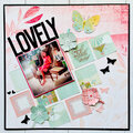
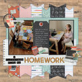
Give a Cheer

 Give a Cheer
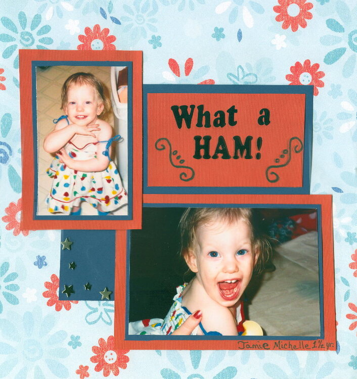
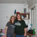
This is my now 15 year old daughter Jamie. I'm trying to get caught up on some of the older photos of my daughters.
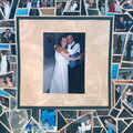
On this LO there are 5 metal star brads on the bottom left corner of the dark blue card stock that are not showing up good on this scan. I really like the way they add to the LO IRL.
No products have been added to this project.

Thanks for spreading positivity!


April 06, 2008
April 06, 2008
February 16, 2008
February 15, 2008
February 15, 2008
February 11, 2008
February 11, 2008
February 06, 2008
February 05, 2008
February 04, 2008
February 04, 2008
February 03, 2008
February 03, 2008
February 03, 2008