

Mother's Day Weekend!
Take an extra 9% OFF with code: LOVE
Take an extra 9% OFF with code: LOVE

 Give a Cheer
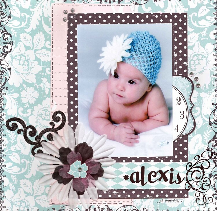
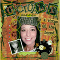
This is a picture of my niece Alexis when she was four months old. I just think that hat is so darn cute.


Thanks for spreading positivity!


March 24, 2010
February 07, 2010
January 03, 2010
December 14, 2009
December 10, 2009
December 09, 2009
December 06, 2009
December 05, 2009
December 05, 2009
December 04, 2009
December 04, 2009
December 03, 2009
December 03, 2009
December 02, 2009
December 01, 2009
December 01, 2009
November 30, 2009
November 30, 2009
November 30, 2009
November 30, 2009
November 30, 2009
November 30, 2009
November 30, 2009
November 30, 2009
November 30, 2009
November 30, 2009
November 30, 2009
November 30, 2009