
Happy National Scrapbook Day!
FREE Gifts + Extra 12% OFF Orders With Code: CELEBRATE
FREE Gifts + Extra 12% OFF Orders With Code: CELEBRATE

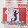
 Give a Cheer
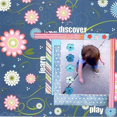
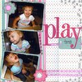
Me getting down to the buisness of joining and DT, or publicaiton. Need CRITIQUE!!! and be harsh
No products have been added to this project.


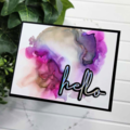
Thanks for spreading positivity!


July 20, 2007
July 15, 2007
July 15, 2007
July 15, 2007
July 15, 2007
July 15, 2007
July 15, 2007
July 15, 2007
July 15, 2007
July 15, 2007
July 15, 2007
July 15, 2007
July 15, 2007
July 15, 2007