Love the primas! The quote is perfect. Ok, this is what I would do... I like that you separated the pics on the right from the other pics, because she's actually biting. I would put the top right pic where the bottom right pic is (but to the right a bit) and put the bottom pic directly above it. I would trim the top of the pics so they are the same height as the 2 bottom pics on the left. Then I would add a second mat for those 2 photos together, and add a prima to the top right corner of the top pic in the double matt. I would keep the word bite almost where it is. I would put a prima to the right of the b. Then after the prima I would put please ? horizontally (level with the b). This way the title will make a 90 degree angle. Then I would put the oval journaling above the pics on the right, under the word please. This is just the way that I would arrange it. Your pics are adorable. I love that you've captured an everyday moment. :) TFS!
Love the quote! I think I might double mat the top right pic. To draw more attention to that pic that goes with the journaling. Love your primas and where you placed them. Nice multi-pic lo.
That's great advice, Jasmine! It took me a while to figure that out. I love how you combined so many pictures on one page. If it were my page, I think I would remove the middle pic on the left. Crop one of the pics on the right and move to the empty spot. Then move the remaining pic to the center of rt side of pg. You could put your journaling below and title vertical over. I was thinking then it would place more emphasis on the photo of her biting. But, that's just my opinion as I like it also the way you have it. I just had the idea and thought I would share. I love the primas and photos!
I love the series of photos! I was thinking if you can do it in Photoshop, how about making the background b&w, and leaving the subjects in color or slightly tinted? This'll put more focus on Meg and her dad. Also, I hope you don't mind, this is just what I've learned thru the forum too, I've learned that to make the color schemes of the pages match the photos, first, you either match the color of your papers to the colors found in your photos (doesn't have to be all the colors, at least 1 or 2 colors would be great) or second, you can just convert the photos to b&w or sepia, or third, if you have a theme in mind, example, christmas, you can just use the reds and greens as part of the theme. I've improved my pages visually by matching the colors of the photo with the paper. Hope you don't mind the long critique.. I love the placement of your photos and flowers too!
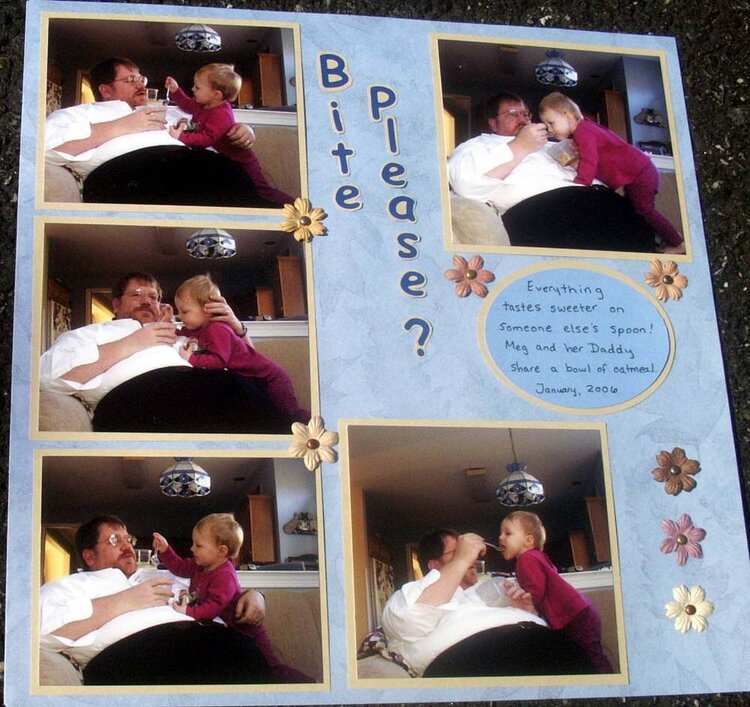
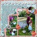
Since I had to move it out of the CM album onto regular 12x12 paper, I took the opportunity to update this one. I'm not totally thrilled with it though. What do you suggest?
Does this project or one of it's images contain pornography, profanity, or other illegal or offensive material? If so, please report it and our moderators will come by and clean it up in a flash.
December 12, 2007
March 20, 2007
March 14, 2007
May 22, 2006
May 12, 2006
May 11, 2006
May 11, 2006
May 11, 2006
May 10, 2006
May 10, 2006