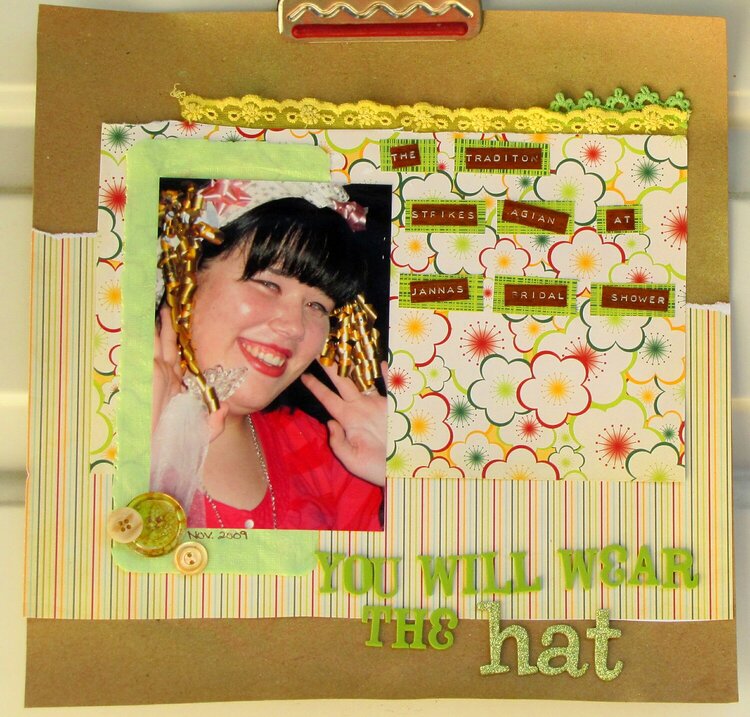
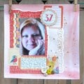
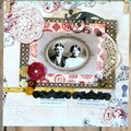
You have some great suggestions here so far -- I agree with Kelli's idea to do something to give the title more punch. And also, the consensus that it could use more red -- maybe a large red flower in the upper left to cover the corner of all the layers and the edge of the trim and some red paint behind the title. I do love the trims and buttons you used and the label strips.
Wicked cute so far :o) Love the photo. The thought that immediately struck me was that the title gets a bit lost on the busy striped paper. Perhaps adding some paint behind it or outlining the letters in a darker color will provide some separation.
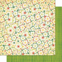
I like this design, and I agree that it needs a bit of a punch. How about another layer? I think a large dark red or dark brown circle underneath everything else, and showing a bit at both the top and bottom would separate the yellow layers from what I believe is a kraft background paper? Then, yes, some more red around the button cluster you have. Maybe more buttons, maybe a flower?
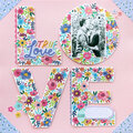
I am liking it so far! But I agree when you say you are thinking flowers. I love all the distressing you used. You could try flowers in either the top left corner, or in the bottom left-mirror the buttons (adorable btw) or perhaps put some flowers on the bottom right corner of the flower paper-or anywhere you like! I am thinking the other DDDs will have some stellar ideas for you!
Does this project or one of it's images contain pornography, profanity, or other illegal or offensive material? If so, please report it and our moderators will come by and clean it up in a flash.


 Give a Cheer


May 05, 2010
May 05, 2010
May 03, 2010
May 03, 2010
May 03, 2010
May 03, 2010
May 03, 2010