SHCG: I like the individual horse pics. The center logo piece has great movement its image, that I'm thinking you can further mimic that somehow either with ribbon or solid cs shapes cut similarly and have it run across the spread behind the title. Also, I think moving the flower under Susans up next to the last s, might create better visual triangles and flow. I'm with Jesse's idea to scoot up that bottom right photo. The Finish pole is a great finishing touch to also signal the end of the lo.
shcg - I think this is awesome. Very cool that you included the photos of each of the horses with their odds of winning AND the finishing order. To me the flowers seem disjointed to the rest of the LO, but that may be because I don't understand the Black Eyed Susans reference with Preakness. Great LO
SHCG: Excellent pics! I like how you tied in the black eyed susans with the title and the accents. I would bump up the lower right pic to be more in like with the one next to it though. Great LO of an exciting event!
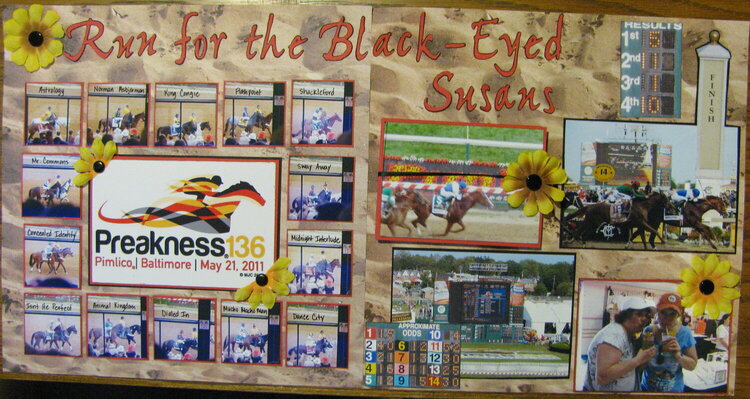
This is my LO for the Preakness, my appetizer for Disney World. All horses pictures are here. I did make an accordian style photo album for some of the pictures I took. The one pic of the horses crossing the finish line if the only picture I did not take.
Does this project or one of it's images contain pornography, profanity, or other illegal or offensive material? If so, please report it and our moderators will come by and clean it up in a flash.
November 18, 2011
October 12, 2011
September 25, 2011
September 13, 2011
September 05, 2011
August 30, 2011
August 22, 2011