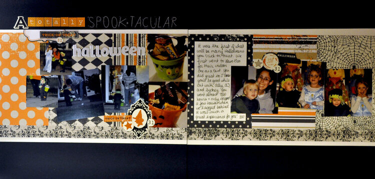
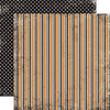
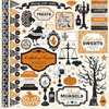
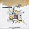
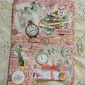
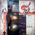
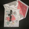
SHCG - Nice sketch use here on this spooktacular LO & great array of pp. Supercute pics, love the detailed journaling. Dig the various title fonts. I also like how the pic placement draws your eyes across the span of the 2 pages.
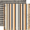
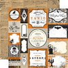
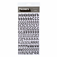
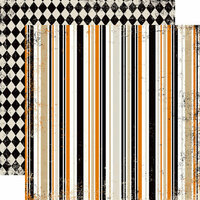
SHCG: The little trick-or-treaters look so adorable in their costumes and in contrast to their larger neighbor. I love your use of this pp stack and the variety to your title alphas. I'd like to see the witch silhouette and its accompaniments moved to the right corner of the pumpkin treat bucket. I also think the orange trick or treat strip might look better on the lawn of the askew picture. I like that you set off two of the pics across the spread in this way. Also I like how the sentiment stickers are placed in a triangle along this two-pager treat.
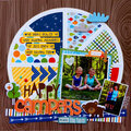
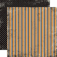
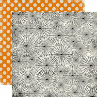
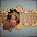
SHCG: This looks like it was a fun night. The pp's are awesome. I do feel it is a bit unbalanced as there isn't enough orange on the left side. Maybe a orange pp behind the last picture on the right would help with the balance. My eye keeps getting drawn to the left LO, possibly due to all the pp's, anumber of embellies and the title are all on that side. Maybe moving the halloween over the three pics on the right page would help.
Does this project or one of it's images contain pornography, profanity, or other illegal or offensive material? If so, please report it and our moderators will come by and clean it up in a flash.


 Give a Cheer


December 02, 2011
November 13, 2011
November 11, 2011
November 08, 2011