
Happy National Scrapbook Day!
FREE Gift + Extra 12% OFF Orders With Code: CELEBRATE
FREE Gift + Extra 12% OFF Orders With Code: CELEBRATE

 Give a Cheer
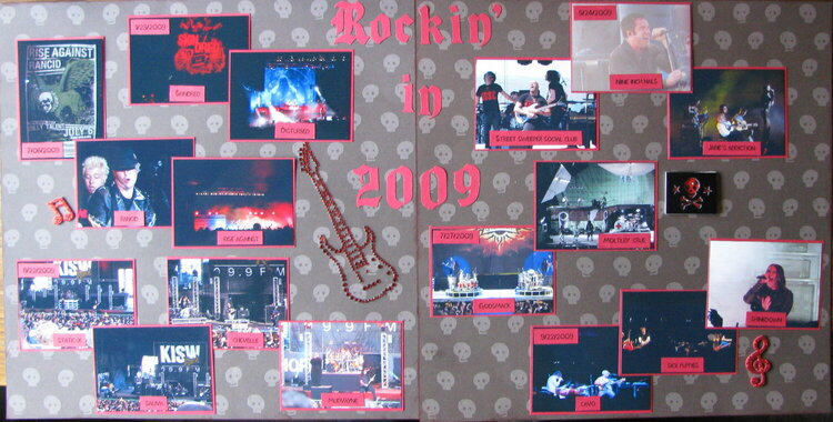
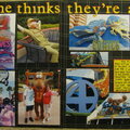
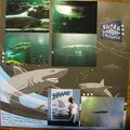
This is a LO for my 2009 year book. A more detailed LO for each show will be in my Rock On! book.
No products have been added to this project.
Thanks for spreading positivity!


December 28, 2011
November 13, 2011
November 11, 2011