Mother's Day Weekend!
Take an extra 9% OFF with code: LOVE
Take an extra 9% OFF with code: LOVE

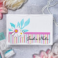
 Give a Cheer
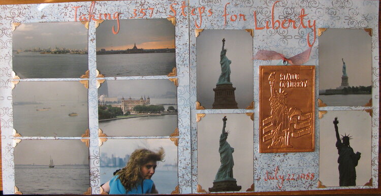
While in NYC in 1988, Barb and I went to the statue of Liberty. We made it all the way to the crown, and our legs paid for it. I swear there are more than 357 steps to the crown but I researched it. I did journal about what happened afterwards: we got back to where her mom had parked and was waiting for us and asked for a bathroom that didn't require steps up...her mom thought a minute and then said to go back there (she pointed) and said "just go up those steps..." We screamed "NO STEPS!). I think we ended up going in there anyway.
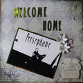
The copper postcard I purchased while there and decided to use it in the LO. Unfortunately, Ellis Island was closed while we were there.
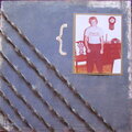
The title shows up much better in person than in this photo.
No products have been added to this project.


Thanks for spreading positivity!


January 11, 2012
December 23, 2011
December 18, 2011
December 16, 2011