I love the bold, bright colors on the lo, Color Me Silly is always so much fun! I'm another person who prefers ribbon over fiber, to me it just always seems to look much neater. Maybe use rhinestones for the center of the flowers? The photos are incredible, every one very special!!
This layout has a great use of color and very lively fun pics. I do think the pics should be matted...that is just a personal style thing for me. i have to say i think the fiber would be better if it were ribbon...but again that is a style thing
I like the color here. Beautiful. I would suggest matting the photos as some other neighbors have mentioned. They tend to recede into the background and they are the best part. Also, not sure what the title is with the "family" and the "smile." I agree that the fiber may not coordinate well but it could just be the scan. It might be fun to add some buttons to the center of the flowers but I like the stitching, too. The tag is very cute with the saying. Fun, fun!
This is terrific! Love the bold cs color and the pp strips on a diagonal. I really like how the biggest pic has part of the title and bracket overlapping (works as a sort of photo corner). I think that the little pic with nothing on it (no brakcets or fibers) could use matting, or a photo corner, or stamping; just something to give it a little more definition like the others have. I don;t mind the look of the fiber, but not sure of the color match. Really do love the overall design :)
Great page design... The only thing I thought of was to possibly add another word similar to "smile" by the little pic on the left. The b/w photos are so nice against all the bright colors!
I agree with changing the fiber to ribbon. What if you grouped the photos so they overlapped a bit? And either pick 1 photo as the focal point and mat it or mat the entire group of overlapping photos. This is a very energetic page so that might help guide the eye to the pictures.
love the diagonal strips of paper and the stitching in the center of the flowers. My only suggestion would be to maybe mat those adorable photos so they don't get lost among the pp.
SO FUN! i love the diagonal PP...neat touch, my only suggestion.....maybe see what ribbon would look like in place of the fibers, that would keep the "clean" look of the layout and fit in the tag slots a bit better maybe.... overall....absolutely love the design and photos!
I love the design with the PP and the photos! Love the stitches in the center of the flowers too! As far as suggestions... I might try to touch up the big photo. It's a great photo, but it's kind of dark. Play with the curves and the levels to brighten it up a bit.
AWESOME LO! I've never thought of putting pp diagonally, great job...love the stitching on the flowers, love the colors. Into my favs it goes! Super cute kids!
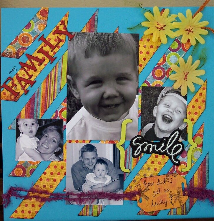
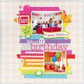
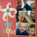
This is one of my faves and even though the paper isn't the "freshest" I like what I did here. Maybe I'll do something similar with another layout or submit this one...
Does this project or one of it's images contain pornography, profanity, or other illegal or offensive material? If so, please report it and our moderators will come by and clean it up in a flash.
April 03, 2007
March 30, 2007
March 29, 2007
March 28, 2007
March 28, 2007
March 27, 2007
March 27, 2007
March 27, 2007
March 27, 2007
March 27, 2007
March 26, 2007
March 26, 2007
March 26, 2007
August 29, 2006
July 05, 2006
June 24, 2006
June 21, 2006
June 20, 2006
June 19, 2006
June 19, 2006
June 18, 2006
June 17, 2006
June 17, 2006
June 16, 2006
June 15, 2006
June 14, 2006
June 13, 2006
June 13, 2006
June 12, 2006
June 12, 2006
June 12, 2006
June 12, 2006
June 12, 2006
June 12, 2006
June 12, 2006
June 12, 2006
June 12, 2006
June 12, 2006
June 12, 2006
June 12, 2006
June 12, 2006
June 12, 2006
June 12, 2006