

Today Only!
Take an extra 8% OFF with code: FLOWERS
Take an extra 8% OFF with code: FLOWERS


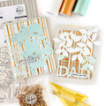
 Give a Cheer
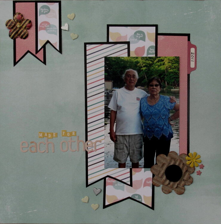
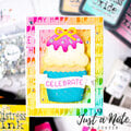
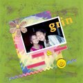
I'm thinking i will change the title lettering, looks a little pale and difficult to read.
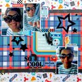
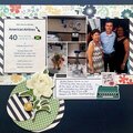
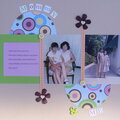
Just a pic of my mom and dad taken in 2011.
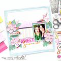
This is for Lisa's March Four Categories challenge - Cat 1 - Metal embellishments. I have 9 brads on here. No twist though.
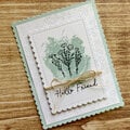
TFL!


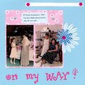
Thanks for spreading positivity!


March 25, 2014
March 18, 2014
March 17, 2014
March 13, 2014
March 13, 2014
March 13, 2014
March 11, 2014
March 11, 2014
March 10, 2014
March 09, 2014
March 08, 2014
March 08, 2014
March 08, 2014
March 08, 2014
March 08, 2014
March 08, 2014
March 08, 2014
March 08, 2014
March 08, 2014
March 08, 2014
March 08, 2014
March 08, 2014
March 08, 2014
March 08, 2014
March 07, 2014