

FREE Standard Shipping on Orders $69+ with code:
FREESHIPPING


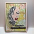
 Give a Cheer
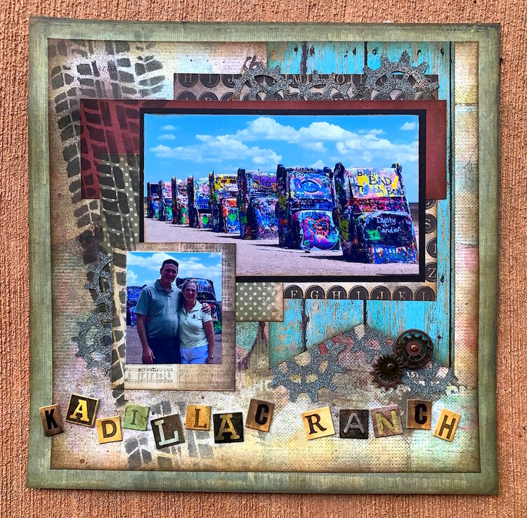
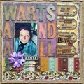
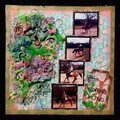
My original of this layout was in desperate need of a face lift. I've never been happy with it, and every time someone looked through our Taos vacation album, I cringed when they got to it. From the day I posted it, I intended to do it over. I think I even said so when I wrote the description in my gallery the day I loaded it.
So this month, a couple of opportunities presented themselves ... the AGC weekly was to do a make-over of an old layout, and of course there is my happy little Do-Overs challenge as well. I'm not gonna lie. I had THIS layout in mind when I sent those two little challenges out there to my threads.
I grouped my old project with this one so it's easy to compare them. Lots of things about it made me unhappy.
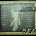
1. I hated the title work. That fringy fiber banner was just awful, and it dominated the whole project. I don't know what I was thinking when I did it.
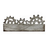
2. The chipboard gears and stamps - I just don't like them. I'm not really a gears kind of girl, and these just didn't fit the image that I had in my head when I did the layout, which was some kind of mechanical wheel thing. I liked the little metal ones holding the banner ends, and I wanted to keep those, but the rest of them had to GO.
3. The harlequin mask. It just didn't fit, and I really didn't like the way the texture paste worked with the photos. Somehow it seemed to be two different kinds of genres going there, and they were mad at each other from the minute I put them together.
4. I liked the big photo of the cars. The colors in the photograph were awesome, but the papers were just too bland - or something - to feature it.
Once I knew what I was unhappy about, I went to work.
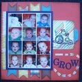
1. I started with a more colorful, though still muted, paper family. This old Cosmo Cricket has been sitting on my shelf for a while. It worked when I did my last "Do-Overs" challenge, so it seemed to be a logical place to start with this one. Low and behold.
2. I used the Monthly Sketch Challenge for September to rework the photos - which I reduced in size so they didn't just overwhelm the whole page. I scooted the smaller picture to a place it fit better. I'm not happy with how that photo printed out, but I can reprint it the next time I'm printing photos.
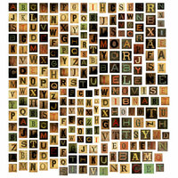
3. Title work got a complete overhaul. No fringy fiber anywhere to be found here. I used some Tim Holtz chip board letters, and while I wish I'd centered them better, I kind of like them wonky off the left edge like that, so I'm going to say I did that on purpose. That's my story and I'm sticking to it.
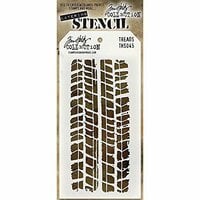
4. Rather than paste, I used a heavy brown mist. I changed the stencil to a tire treads one, which makes more sense and still gives the layout that "old car" kind of feel. The little gears stayed and I am much happier with the "on the edge" steampunk ones, which I embossed with some hand mixed embossing powder to create a kind of patina rusted look.
So there you have it. Side by side. I can quit fretting over the old because I pretty much LOVE the new.


Thanks for spreading positivity!


November 06, 2017
September 21, 2017
September 21, 2017
September 21, 2017
September 21, 2017
September 21, 2017
September 21, 2017
September 21, 2017
September 19, 2017
September 18, 2017
September 14, 2017
September 13, 2017
September 09, 2017
September 09, 2017
September 09, 2017
September 09, 2017
September 08, 2017
September 08, 2017
September 08, 2017
September 08, 2017
September 06, 2017
September 06, 2017
September 05, 2017
September 05, 2017
September 04, 2017
September 04, 2017
September 04, 2017
September 04, 2017
September 04, 2017
September 04, 2017
September 04, 2017
September 04, 2017
September 03, 2017
September 03, 2017
September 03, 2017
September 03, 2017
September 03, 2017
September 03, 2017
September 03, 2017
September 03, 2017
September 03, 2017
September 03, 2017
September 03, 2017
September 03, 2017
September 03, 2017
September 03, 2017
September 03, 2017
September 03, 2017
September 03, 2017
September 03, 2017
September 03, 2017
January 25, 2013
January 20, 2013
January 17, 2013
January 12, 2013
January 07, 2013
January 05, 2013
January 05, 2013
January 05, 2013
January 04, 2013
January 04, 2013
January 03, 2013
January 03, 2013
January 03, 2013
January 03, 2013
January 03, 2013