SHCG: I really like the "black & white with red all over" color scheme, the elements you picked out, and the dramatic diagonal tearing. I just wish the photo was larger and covered part of the diagonal line. Not that I don't like this page but boy would it really pop with a 5 x 7 photo instead.
SHCG: I really like your grouping on the red, but the photo and the word siblings feel like they don't like each other. :) I'd move the photo in a bit closer so they feel like a happy family. Great page!
SHCG: I dig this--the color scheme, inking, tearing, deco edges, glittery circles, heart clip, button, and title. I'd just place the photo upright and have it overlap the red a bit. I can also see some white swipes bordering the photo to make it appear larger.
shcg: great color choice and journaling for this. i'm drawn more to the journaling and that portion of the lo compared to the photo. i'd love to see the photo grouped with the journaling to create a triangle-effect.
SHCG - Great photo & journaling! The colors & elements on this LO are nicely dramatic, the same way that mask is, cool. Lotsa good stuff going here. However, I feel my focus conflictingly gets split on this page, between the lower left corner w/ the bright white journaling block & eye-catching pp behind it plus the vivid red background, versus the very-angled floating pic plus embellies on the top right. I suggest you kind of cluster things in the eye-catching red lower left corner. Like have the photo use the dotted pp as a base "frame" & then move the journaling block up slightly while overlapping the pic slightly. (And move the "siblings" title anywhere around that grouping that makes sense). That way, a viewer's focus is drawn all to that one showstopping corner w/ the pic & journaling. The black upper right corner would be left blank but negative space can sometimes be so powerful in creating drama for the rest of a page, particularly one w/ just one photo. Overall, excellent instincts on this one! Again, so sweet of you to do this for your brother.
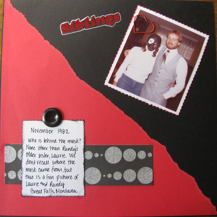
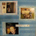
For my brother's book. This is a picture of my older sister and my brother. We can't recall where the mask came from but it was so out of character for our older sister to do something like put on the mask, let alone let a picture be taken of her. I tried to stick with the color scheme but I think it might be missing something.
Does this project or one of it's images contain pornography, profanity, or other illegal or offensive material? If so, please report it and our moderators will come by and clean it up in a flash.
October 19, 2009
October 09, 2009
October 05, 2009
October 02, 2009
October 02, 2009
October 01, 2009
September 29, 2009
September 27, 2009
September 26, 2009