


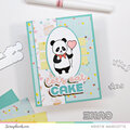
Happy National Scrapbook Day!
Extra 10% OFF Select Scrapbooking Brands with Code: NSD24
Extra 10% OFF Select Scrapbooking Brands with Code: NSD24

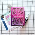
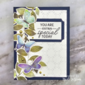
 Give a Cheer
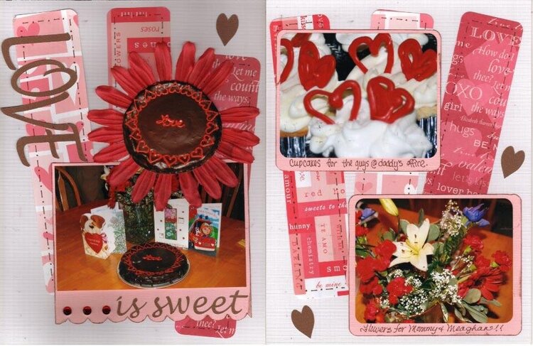
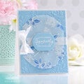
Valentine's goodies
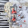
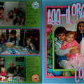
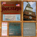
I scraplifted this from Brandibug's 'She's Home' layout. Unfortunately, I don't seem to have done it justice. I'm not sure what's missing/off. Help!
(FYI, I fixed the petal that was stuck under the center. and I lowered the bottom right corner of the lefthand picture so it's not crooked.)
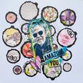
Thanks for spreading positivity!


April 20, 2008
April 17, 2008
April 17, 2008
April 17, 2008
April 16, 2008
April 16, 2008
April 16, 2008
April 16, 2008
April 16, 2008