AWWWW Misty!! This is amazing. How incredibly brave of you to post something so personal. Yet, You did it in an honorable & beautiuful way. Just perfect!!!
what a courages-deep- and beautiful lo. if anything i would add a horizontal pp stip along the botton from the right to connect w/ the verticle ones. this is beautiful. TFS
Stunning LO! I think the journaling strip is perfect. The black is so striking. I love the different inks & stitching. Your picture angle is beautiful.
Kim
It's perfect. Don't make any changes. I beg you! :) Thanks for sharing something so personal. I think the different pp and the different colors make an interesting contrast, one that fits the mood of the lo. Great work!
Wow! Your journaling is awesome. I know that it must be a difficult subject to journal about, but it is an important part of you. I think so often of how much I would love to have scrapbooks like these from my ancestors. With this one I thought of my grandfather. His father was abusive and abandoned his 6 children. I wonder what my great grandfather was thinking, but I also wonder how this affected my grandfather. I wish I had something like this from him. I am sure that your children will treasure it and that they are blessed to have a mother that cares.
Wow, this is amazing! I love all the inking and stamping you did. I love how you did the monogram over the stitching. I love the big flower and the strips of pp, but most of all I LOVE the feeling behind this. I'm sure all those WHYs have been floating around in your head all of your life. Just remember, some people aren't meant to be parents and it's his loss for missing out on you. ((hugs!))
TFS!!The darker colors help balance the white space. The W in the upper corner, the title, the large flower at the bottom and the strips all help bring the focus back to the pic. Mistlynn don't be bitter, you may have missed out on your father, but your father has missed knowing such a talented person.
I wouldn't change a thing. It's sincere and wonderful. And how sad for you growing up. But you'll be glad you did this, it's like therapy. Beautifully done!
Misty, this must have been a difficult page to do considering the content, I can see why you want it to be perfect, and IT IS - don't change a thing sweetie, I love it all, it is thought provoking, well balanced, the photo is amazing and I love the colours, the addition of your own handwriting is perfect, TFS :)
I think this is beautiful! I agree that handwriting may make it more personal, but is is so lovely this way too. I love how honest your journaling is too.
I love this layout just how it is!! Honest! It is well balanced and I think the question strip is well done. It would look good also if you wanted to do it in your own handwriting too. But, I wouldn't change anything.
I wouldn't change a thing! It is a LO that is not only aesthetically pleasing with numerous stunning elements...but it perfectly conveys the questions you are asking from the heart...I especially like the use of the different fonts for each question....Thank you so much for sharing...and congratulations on putting so much of yourself and your vulnerabilty in this LO.
i agree with blurose....maybe you are not used to seeing so much white...i have the same problem! but honestly i think this LO is absolutely awesome! The photo is beautiful and the journaling is genuine! I think that the journaling is the focus on this LO and that you did a great job at making it stand out! i like the question marks....Be proud of this LO misty...it is really unbelievable! if anything maybe what helen said with something handwritten to put that last personal touch on it or a bit of inking it that corner as well, but i don't by any means think it absolutely NEEDS it, sometimes we tend to think we need to fill up every single bit of space! he eheeee...but i love it!
I think I would struggle with the same question. But I love it, the way it is!!
The stitched corner behind the w is beautiful as are the words *why* I love the inking, and the big flower looks BEAUTIFUL!!!
hey, this layout is great, I think it is impotant to scrap all areas of our lives, not just the good ones. I love how it is now it looks great, but I think it would be more personal if you used yur own handwriting, either way though I think its great!!
The first thing i noticed was the lovely stitched corner W. Its great, I think the page has balance, we are so critical of our work. Maybe you are not used to seeing so much white, if so perhaps some more distressing ink, i like the questioning strip. JUst a thought but perhaps some handwritten journalling about your answers, on bottom of page. LOve that W. Looks great TFS :)
I like this LO a lot... thank you for sharing. I should probably do one about my dad, might be theraputic! Anyway, I like it the way it is, but doing the journaling in your own handwriting, might make it more striking and personal. But that is up to you! I love LO that are so truthful and honest... once again, thank you for sharing it!
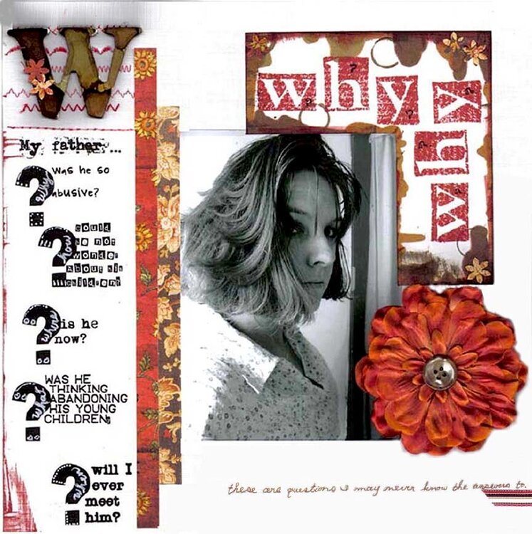
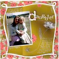
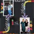
I'm really not sure about this one... I kind of want to rip that question strip off and just do it in my own hand writing. PLEASE HELP. I'm not sure it's balanced and this lo means a lot to me, I want it to be nice.
~~~~~OKAY, I've now added some journaling in my own hand that says, "These are questions I may never know the answers to." (it looks a little skewed in the pasting process) Thanks so much to everyone for your sweet comments and advice!
Journaling: My father... Why was he so abusive?, How could he not wonder about his children?, Where is he now?, What was he thinking abandoning his young children?, When will I ever meet him? I used alcohol inks around the "WHY's". I stamped the "why" with Paper Studio's impression alphas and Tim Holtz's Brick distressing ink. Daisy D's ppr and Frances Myer ppr. I also distressed a K&co Monogram with the Alcohol inks, and sewed different stitches behind it.
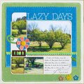
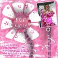
Does this project or one of it's images contain pornography, profanity, or other illegal or offensive material? If so, please report it and our moderators will come by and clean it up in a flash.
September 21, 2006
September 20, 2006
September 19, 2006
September 19, 2006
September 18, 2006
September 16, 2006
September 12, 2006
September 12, 2006
September 12, 2006
September 11, 2006
September 11, 2006
September 10, 2006
September 10, 2006
September 10, 2006
September 10, 2006
September 10, 2006
September 10, 2006
September 10, 2006
September 10, 2006
September 10, 2006
September 10, 2006
September 10, 2006
September 10, 2006
September 10, 2006
September 10, 2006
September 10, 2006
September 10, 2006
September 10, 2006
September 09, 2006