Happy National Scrapbook Day!
Extra 10% OFF Select Scrapbooking Brands with Code: NSD24
Extra 10% OFF Select Scrapbooking Brands with Code: NSD24


$29.99
$29.99
$230.00 $57.27
$75.00 $29.99
$80.00 $34.99


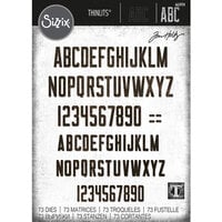
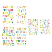
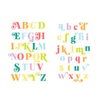
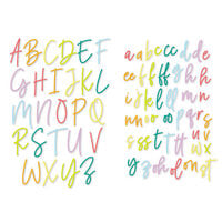
I have these alphas in black and brown, and for the most part really like them. They are not completely solid--have a slightly distressed look that doesn't show up in the picture. My only complaint is that on the letters that have a skinny part (like the "y" or "e"), they tend to bend when trying to peel it off the backing, so it forms a slight crease and it becomes weak enough that you have to realign it with the rest of the letter to try to make it look perfect again.
You must be signed in to comment. Please click here to sign in.