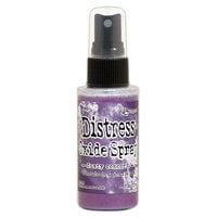


$13.00 $12.39
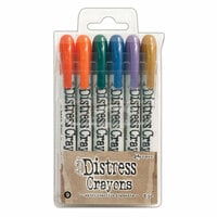
$72.00 $68.49
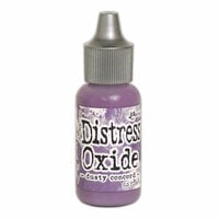
$13.00 $12.39
$84.00 $79.99


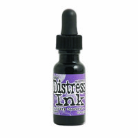
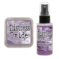
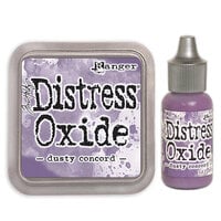
Add rich, vintage-inspired color to your projects with the Distress Ink Pad in Dusty Concord by Tim Holtz for Ranger Ink. This deep, muted purple ink is perfect for journaling, card making, and mixed-media creations. Designed to create aged, stained, and distressed effects, this acid-free, non-toxic dye ink blends beautifully on paper, fibers, and porous surfaces (all sold separately). The 2" x 2" raised pad allows for easy inking of stamps (sold separately) or direct-to-paper techniques. Whether you're stenciling, stamping, or blending, Dusty Concord brings an elegant, moody depth to your crafting, making it a must-have for your ink collection.

All of the Tim Holtz Distress Ink colors work so well together, I think.
This Dusty Concord is a beautiful color for single use.
I used to use Vintage Photo or Walnut Satin to add the dark shade for the edges.
This time, I used this Dusty Concord, I could get the elegant and decent impressions.
When making 2-3 color layers, this color's effect is various ways.
Mixing color is so fun and methods is so many ways.
These ink pads is a must tool for me to express the image I want wider.
Personally, I love the mixture of Dusty Concord, Scattered Straw (http://store.scrapbook.com/gb-tim21483.html), and Wethered Wood(http://store.scrapbook.com/prp-thtim20257.html).

I don't "do" purple that often but this is a lovely color that is a good mix of intensity and brightness so it is still colorful and yet still somewhat subtle. It goes really nicely with COPIC V 15 if you want to stamp and color in flowers.

Thats what I would have called it. I am not a perfect distresser but I definatley love this brand of pads. And since this is my all time favorite color had to add this to my collection.
Used in this project: It Is Love

Nice deep purple color. When I first got it, I wasn't sure how often I would use it. But I began to delve into my basic grey wisteria pack and ended up distressing almost all of the edges with dusty concord -- beautiful!
Used in this project: Venice (1)

Creates a vibrant purple. Lovely for spring projects. Very easy to use.
Used in this project: Embrace the Journey

With purple being my favourite colour, this colour works perfectly for me! It can be a bit on the darker side, so I find it needs to be applied lightly
Used in this project: Me

I just bought this color and already I'm addicted to this color. It's so vivid and pretty. It makes anything look great.
Used in this project: Inside Card

This inks are the best! They come in a lot of colors and they're perfect for inking paper. One of the things I love the best too is that if you use this ink on a rubber/clear stamp you get this really great aged look. i just LOVE these!!!
Used in this project: My Florida Trip

I love distress inks. Their color is so rich and vivid and really add great depth to a project. This one is no exception! Anything with Tim Holtz' name on it has always been great in my experience!
Used in this project: Monster Tag
I love all of Rangers Tim Holtz distress inks, the colors are perfect in any project not just for grunge and steampunk, the colors are also very pretty. this is my fav color
You must be signed in to comment. Please click here to sign in.