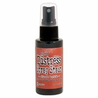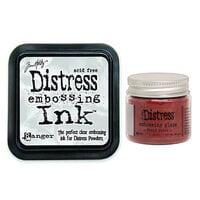


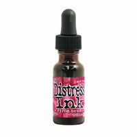


Enhance your crafts with the bold, rustic charm of Fired Brick Distress Ink by Tim Holtz and Ranger Ink. Ideal for creating rich backgrounds, vintage edges, and layered textures, this deep red ink is perfect for holiday cards, art journaling, and mixed media. Reacts beautifully with water for unique effects.
$13.00 $12.39


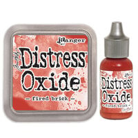
Add rich, vintage depth to your projects with the Fired Brick Distress Ink Pad from Tim Holtz and Ranger Ink. This 2" x 2" water-based, acid-free, non-toxic ink pad is ideal for creating aged, distressed effects on paper, fibers, and photos. The raised felt pad ensures even application on stamps, edges, and detailed designs. Reacts with water for dynamic textures and blends seamlessly for layered backgrounds. Use with stencils and stamps (sold separately) for endless creative opportunities. Perfect for Valentine's Day cards and Christmas scrapbooks, this ink pad is versatile for any stamping or mixed media collection.

The red of this ink is very deep and absolutely gorgeous! It's great for inking edges and distressing pages.
Used in this project: Brian Andrew

I love the Tim Holtz Distress Ink Pad line. The Fired Brick is a nice red to add a touch of zip to your layouts. I love to use this in red, white and blue themed pages. These pads are easy to use and last a long time.
Used in this project: I want to be a cowboy inside

This inks are the best! They come in a lot of colors and they're perfect for inking paper. One of the things I love the best too is that if you use this ink on a rubber/clear stamp you get this really great aged look. i just LOVE these!!!
Used in this project: My Christmas Cards


These are amazing inks, beautiful colors, and great for the aged look on layouts. I always find myself turning to these
Used in this project: Erica closeup
I love the whole distress ink collection. This is a very red red and the raised ink pad part comes in really handy.

This is a vibrant addition to my distress ink colors. Keep the colors coming !


I love Tim Holtz distress inks - they work so well with blend and stamping.
You must be signed in to comment. Please click here to sign in.