Scrapbook.com Exclusives 20% to 60% OFF
Plus, Take 10% OFF Orders $100 or More! Use Code: CRAFTY
Plus, Take 10% OFF Orders $100 or More! Use Code: CRAFTY


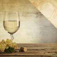
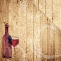
I used the cork side to highlight a scrapbook layout about our trip to the California Wine Country. The design fit perfectly. The reverse side is not as attractive: it's supposed to look like wine glass stains but frankly looks sort of like blood. The paper is much thinner than I like but since I only used a portion for accenting it worked out okay.
You must be signed in to comment. Please click here to sign in.