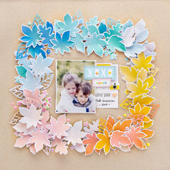
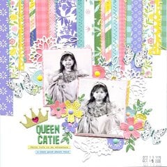


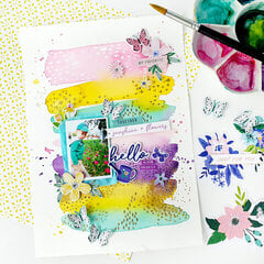


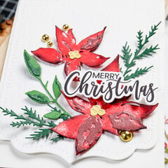
Happy National Scrapbook Day!
Extra 10% OFF With Code: NSD25
Extra 10% OFF With Code: NSD25


$6.00 $4.99
$8.00 $6.99
$24.00 $18.99
$32.00 $26.49
$24.00 $19.99
$6.00 $4.99
$8.00 $6.99
$6.00 $4.99
$8.00 $6.99


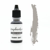
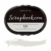
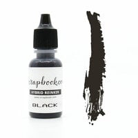
When a Rainy Day chases your sunshine away, it's time to craft! This must-have ink color is an absolute staple in your stamping supplies. Make sure you have a great gray for your project with the Scrapbook.com Rainy Day Premium Hybrid Ink Pad!
Contents: One premium hybrid ink pad
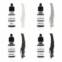
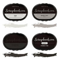
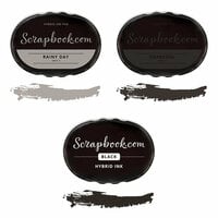
Color: Rainy Day
Color Family: Gray - Gray 2
Type of Ink: Hybrid ink
Size: 2 1/8" x 3 1/8" oval
Features:
Compatible With:
What is the difference between dye, pigment and hybrid ink?
Dye inks are water-based and literally dye your paper. The ink is soaked up by the paper or cardstock so they tend to dry fast. Pigment inks are made of tiny particles that will sit on top of your paper and will take a longer time to dry. They tend to be brighter, with a denser saturation of color and work well with dark colors of cardstock. They are also great for heat embossing since they stay wet longer. Hybrid inks are the best of the two ink types (dye and pigment) as they have properties of both inks. They also tend to be more translucent in their appearance. Hybrid inks are suitable for all skill levels of crafters due to their compatibility with multiple mediums and surfaces.
What are color families?
The Scrapbook.com Hybrid Inks are designed in color families. Each color family has four individual colors numbered 1 through 4 (1 being the lightest shade in the group and 4 being the darkest shade of the group). Color families are an extremely important aspect of layered stamping because each of the four colors coordinates together to achieve a dimensional, layered look. Every Hybrid Ink Pad has the color family name and the color family number clearly labeled on the lid along with the name of the ink pad and the ink shade. NOTE: The 1 color for some color families is designed to be an incredibly light whisper of a shade for that group.
Tips for use:
This is an exclusive Scrapbook.com product!
Number of pieces: 1

This is truly a rainy day color. It is good for darker shadows, as well.

I think this ink is just fine as an ink and as a pad. I definitely get the essence of a rainy day with this gray, but it sure is light in application. The contrast is very low (even on a white background) and I admit I was a little disappointed.
To compare, I ordered Wendy Vecchi's Make Art - Blendable Dye Ink Pad in "Watering Can." Watering Can is what I think of when I think of a medium gray ink. I did comparison stampings of the two inks: WC is darker than "Rainy Day," which comes off as a ghost impression of Watering Can.
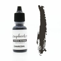
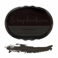
You may want to order "Charcoal" if you're planning to use a Scrapbook.com gray ink that you want to contrast against other media in your work.

I reviewed the Rainey Day ink pad. The reinker is the same.
This review was written about a related product.
This is a bit more fluid than an ink refill.
This review was written about a related product.

Love the GRAYS :) This will do for my rainy, foggy, night time themes re: cards.
You must be signed in to comment. Please click here to sign in.