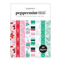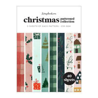


$30.00 $21.99
$3.00 $2.49


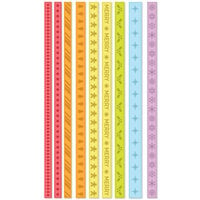
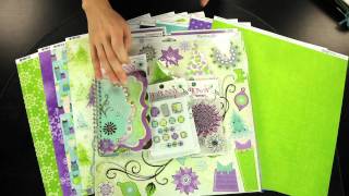
This paper is pretty subtle in it's print. The shades are muted together, and I believe it would go well in a scrapbook layout. It is not so busy that it will compete with the photos in the layout. I will be using it in conjuction with other papers in the collection for my Christmas cards this year. The green side is great too, because it has slight graphic lines that make it easy to cut straight lines accurately.
Used in this project: Winter Wonderland
You must be signed in to comment. Please click here to sign in.